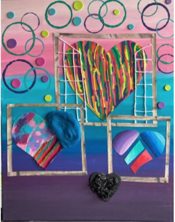
Level 2 Art
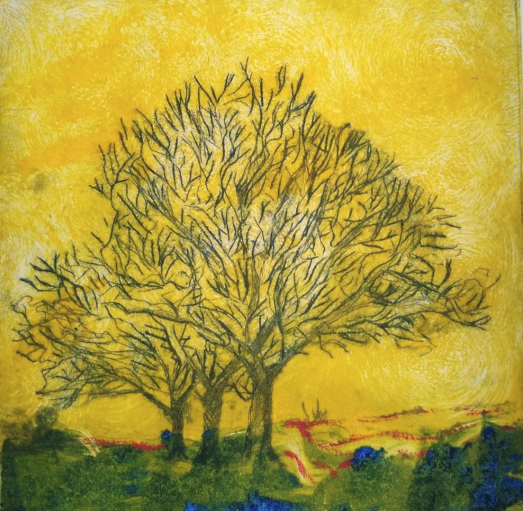
Trees are symbolic of time and transience, environment, food and shelter, the elements, weather, identity, and spirituality.
When I began the final themed project, I had no idea where the journey would take me. And I saw this project as a journey – two journeys in fact. The first journey was about exploring the landscape focusing on trees within the landscape. The second journey was my development as an artist. My first experience of focusing on trees in the landscape has been to look at trees. Trees are so ubiquitous that they become invisible. When I took my first photoshoot, I quickly became inspired by the tree. The tree created a sense of ‘wow. It was only later that I understood my experience to be called ‘the sublime’. I decided early on in my work I wanted to capture the sublime. Having taken many photographs and walked miles through woodland and open moors that there is an invisible pattern in nature. I was inspired by the tree ‘on the solitary path to Penistone Hill’ -- a tree – alone, windswept, stoic. It did not take me long – I only had to look – that the lone, windswept, stoic tree is everywhere
My experience of the sublime coincided with COP26, a world conference on climate change which took place in Glasgow. It was the COP26 media narrative that ignited my journey towards the destruction humans are having on the environment. Simultaneously, I became aware that every aspect of the environment I was looking at is ‘man’ made. The fields, the hedgerows, the country lanes, the flora, and fauna – where all there due to man’s impact on nature. This thought led to the idea of spirituality within nature – an awe of nature. I began to consider the pagan beliefs of the green man – the shiver down the spine when in the heart of an ancient wood. As COP26 progressed, I became disheartened by the depressing state of the world. I did not want this sadness to be part of my final piece. I want my piece to cause a smile not a tear. I reflected how I could use visual language about the environment without being depressing. I decided simply to focus on the beauty of the tree, Its symmetry and asymmetry, its standing place in the landscape, its texture, movement, its everything. I wondered if a beautiful tree would be sufficient to advocate for the environment.
Printing making is not 100% environmentally friendly. The print studio is effortless in managing the impact of printing on the environment in the purchase of inks and up-cycling of printing tools, rags, paper. And recycling of rags, inks, waste products.
Some process, I felt were not environmental friendly such as use of light emulsions, silicone, and nitric acids. Other such as oil based inks are used sparingly.
In my personal art making, I have imposed self limits. When using oil based inks, I limited by use of the inks. I would use one or two colours for my entire printing session to that every drop of ink I took from the tube was used to make art. I made efforts to waste no ink. I would recycle paper printing on both sides, or use newsprint rather than higher quality paper when experimenting.
I have made conscious decisions not to follow certain techniques because I was uncomfortable with media used - such as silicone in waterless lithography. And I chose particular types of material because they are more recyclable, for example, aluminium plates for drypoint rather than Plastic Perspex -- Aluminium is an infinitely recyclable material.
For my final piece, I used drypoint. I like this method of art making because of its
physicality. Forcing a pointed tool into the metal plate is for me an essential part of the art making process. Every mark I make into the plate, I have created, scratched, burred. I feel the process creates an honesty to the art. The inking process and the rolling of the press requires more work and until the print comes out of the press, the outcome is unknown. For me, the process of creating the print is the most important part, the most rewarding. Getting a good print is just the cherry on the cake.
I used scrim to create the swirls, twisting the link into the plate.
The swirls in the sky are clearly seen - giving a sense of movement in the sky. I applied ultramarine blue to the foreground and used a piece of card to create a horizontal wave, creating movement in the pathway. The blue ink mixed with the yellow ink to create green – yet dashes of the ultramarine blue remain like gemstones.
This print is very painterly
An incredible achievement Colin. The final print is expressive and beautifully done. It sums up your extensive development in this media and showcases your talent for printmaking and eye for detail. The story behind it and your reasoning behind the choices you made were telling of a true artist and we congratulate you on a wonderful final project.