Wells Fargo: Branding , 1990
h = 30, d = 0.1 in

When asked to do a complete redesign of every consumer touchpoint for Wells Fargo, I knew that their identity was no longer solely an in-branch experience—they had to have a strong presence in a person’s wallet, too. This series of full-bleed photographic credit cards was an industry first. I placed the script-style logo at the top of the card—that way, every time you opened your wallet, the bank’s name was visible above the card slot.


Plus de Massachusetts College of Art and Design

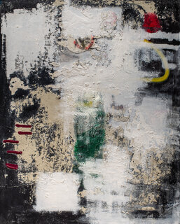
Your Move, Phase 2 , 2020
60 x 48 in (h x w)
Acrylic / pastel / charcoal on canvas
Massachusetts College of Art and Design
They Roll Their Own Dice , 2020
56 x 32 in (h x w)
Acrylic / pastel / ink on canvas
Massachusetts College of Art and Design
T Square , 2020
24 x 24 in (h x w)
Acrylic / pastel on panel
Massachusetts College of Art and Design
Emerald Park , 2019
46 x 45 in (h x w)
Acrylic / charcoal / sand on canvas
Massachusetts College of Art and Design
her favorite pony is rainbow dash : the maximum effective range of an m16 is 550 meters , 2019
60 x 48 in (h x w)
Acrylic / spray paint / cement / oil on canvas
Massachusetts College of Art and Design